
The modification of the LCMS cross logo from burgundy to blue is one of the most notable changes in the Synod’s refreshed branding that is being introduced in April, according to Vicki Biggs, director of Integrated Communications for the Synod.
“Our refreshed branding will help members and the general public alike to know that amidst the many changes taking place across the Synod as a result of restruc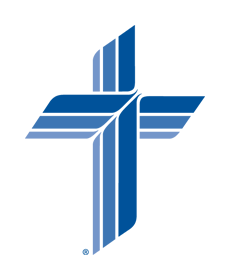

Other changes to look for in the Synod’s refreshed branding initiative include:
- new standards for using the LCMS cross logo along with the “Witness, Mercy, Life Together” emphasis logo when both appear together on the same piece.
- specific “Witness, Mercy and Life Together” logos for use in brand marketing settings.
- a new color palette for LCMS communications materials.
“When used appropriately,” Biggs pointed out, “the addition of the LCMS cross logo and emphasis logo on such things as congregational and school websites, print materials and promotional items helps to associate those organizations with the larger church body and better communicate their mission and ministry.”
She added that in addition to congregations and schools, certain other organizations related to the LCMS may have permission to use the cross and emphasis logos.
Check out all the LCMS refreshed branding updates at www.lcms.org/brand.
Posted April 2, 2012
